
Person
The basic page for a customer or employee. Depending on who it is, and who is viewing them, different widgets are available.

Place
A longer page for a location. This can be viewed by employees, managers and office employees to manage and monitor locations across North America.

Thing
A page used for a truck, trailer or any piece of (rental) equipment. As users move across the country, their journey is automatically updated and employees can send notes to each other for smoother experiences.
Research
I spent a great deal of time "in the field". I used a variety of techniques to research how our internal tools could be improved. These included...
- User shadowing.
- A/B testing processes and flows.
- User testing of existing apps and new prototypes.
- Recruiting employees to walk me through their routines.
- Doing a week of training and working behind the counter.
- Interviewing program managers and other stakeholders.
- Auditing all our existing internal tools.
- Using session logs to watch users click through sites and see what errors commonly occurred.
- Listened to customer service phone calls to hear what problems could be better handled.
User testing
I used low fidelity mockups to quickly cycle through ideas. Often at a location I would sketch up a flow on paper and see how an employee or customer would react. After getting good feedback I would create a wireframe in OmniGraffle and do another round of user testing. Sometimes this step would be skipped and we would go straight to HTML without the backend hooked up. The idea was to validate ideas with as little effort as possible.
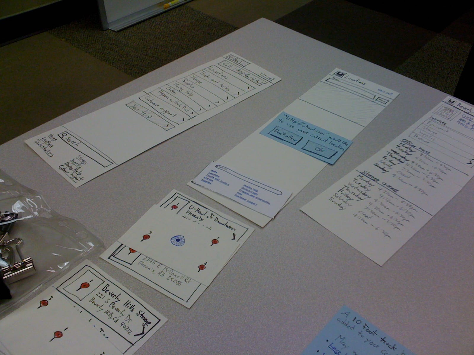
Each notecard represented a section for a page.

If anyone had an idea, they just added a new notecard.

An early wireframe for the dashboard, conveying how close a location was to reaching their goals.
Insights
- Users wasted a great deal of time recovering passwords for the various systems and often ended up just sharing them.
- Users spent time writing something down outside, then taking the information back inside to enter into the computer. Let them use the phone in their pocket for more tasks.
- Most of the information centers around a Person (employees, customers), Place (U-Haul location) or Thing (Truck, moving supply, storage unit). Make a template for each so everything feels familiar once users encounter one of them.
- Internal lingo and acronyms are not helpful to new users, simple terms should be used whenever possible.